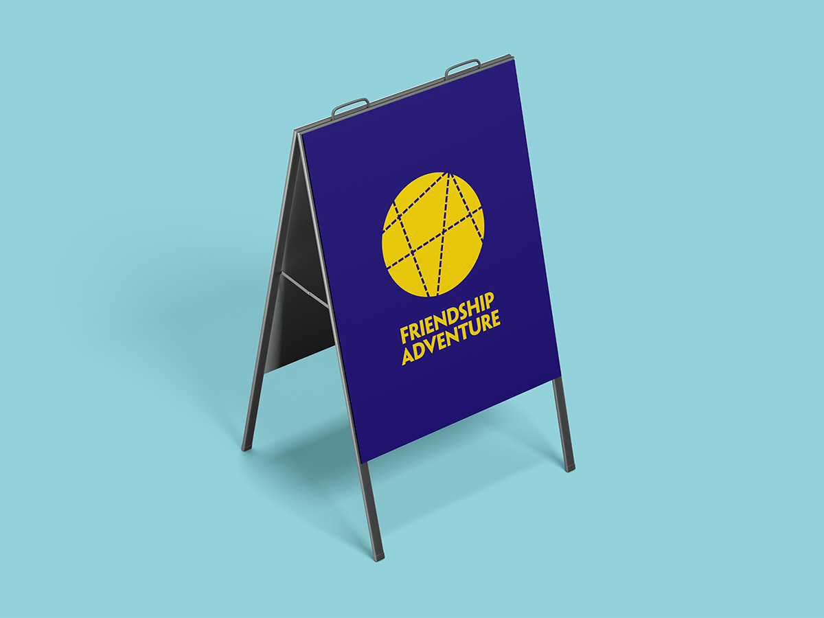
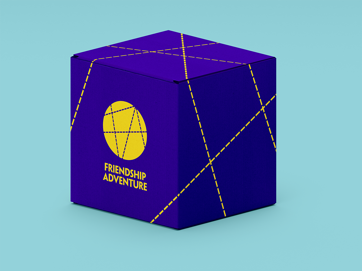
Craft beer brewery Friendship Adventure needed an identity system that could work across their product, digital and merchandise offering. The identity had to embody the spirit of the Friendship Adventure story: two friends sitting down to make a plan, over a beer. Also important was the concept of adventure and the spirit of nostalgia.
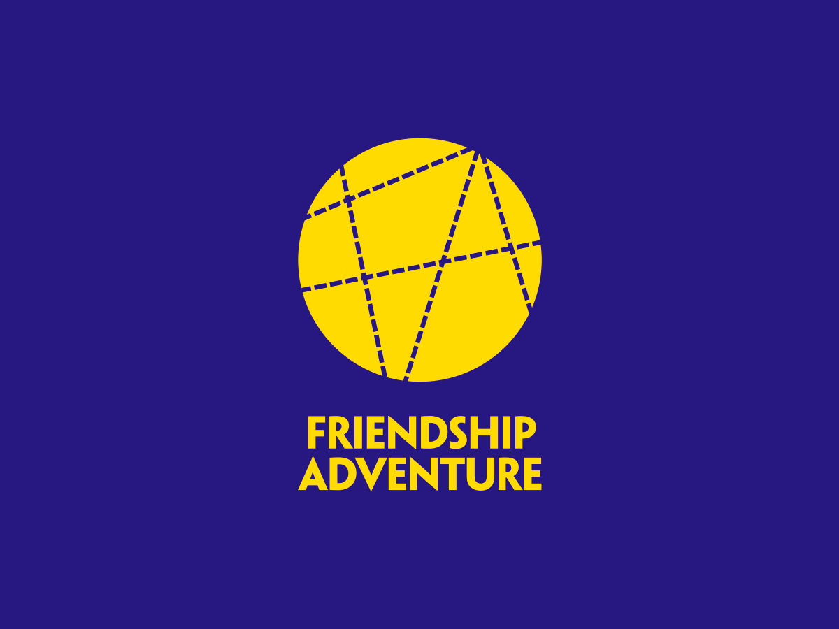
The finished identity uses the idea of ‘song lines’ or map trails criss-crossing to represent the paths of friends intersecting as they embark on their adventures. These lines are bound by a circle in the lead identity, but can be continued outside of the logo to create an almost infinite number of unique executions.
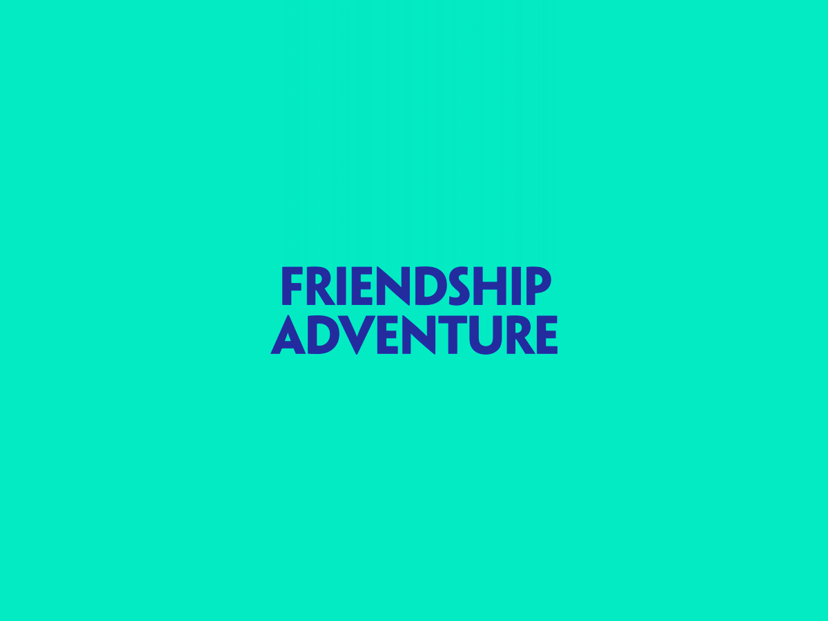
The name mark is rendered in Penumbra Sans Bold and is reminiscent of the typography of many children’s adventure book covers from the 70s/80s. The spacial relationship between the badge and name mark echoes that of the publisher logos on these books.
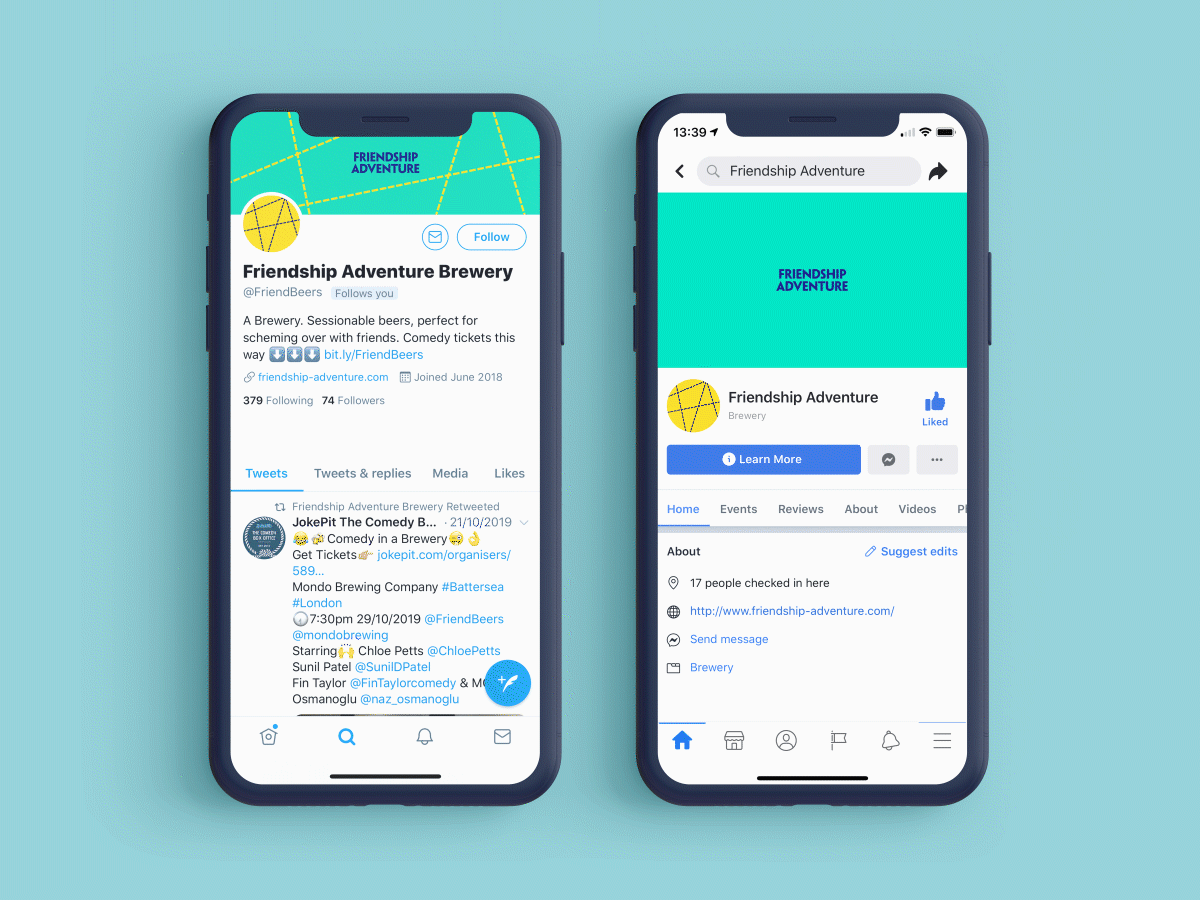
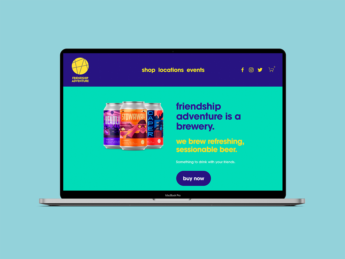
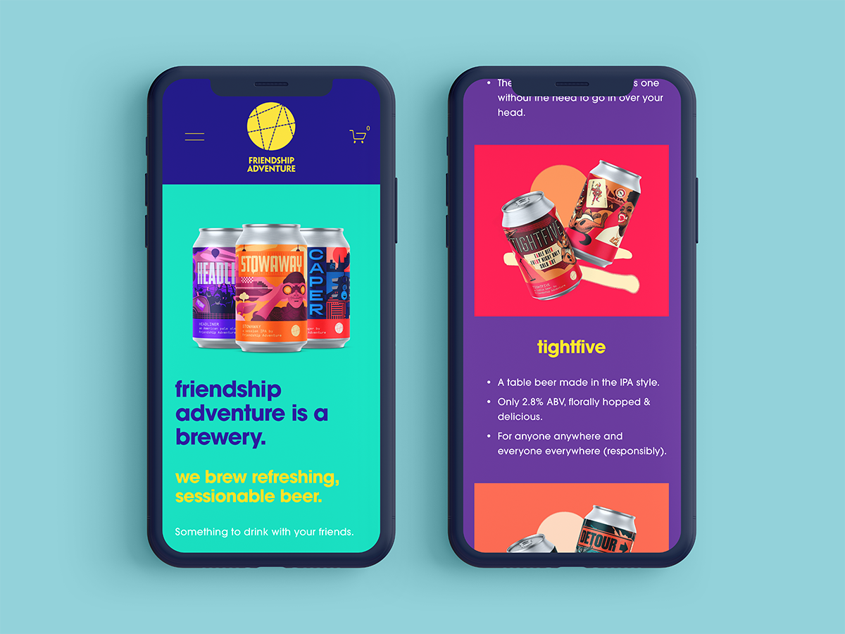
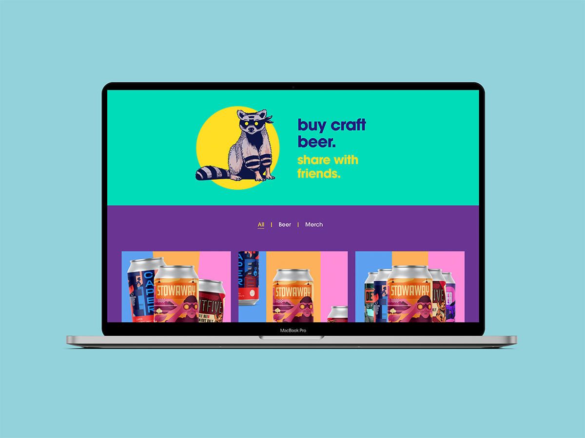
Taking the lead from the main identity, the website design uses bright, block colours and bold typography to present no-nonsense messaging that lets the product take centre stage and leads the user to where they can shop.