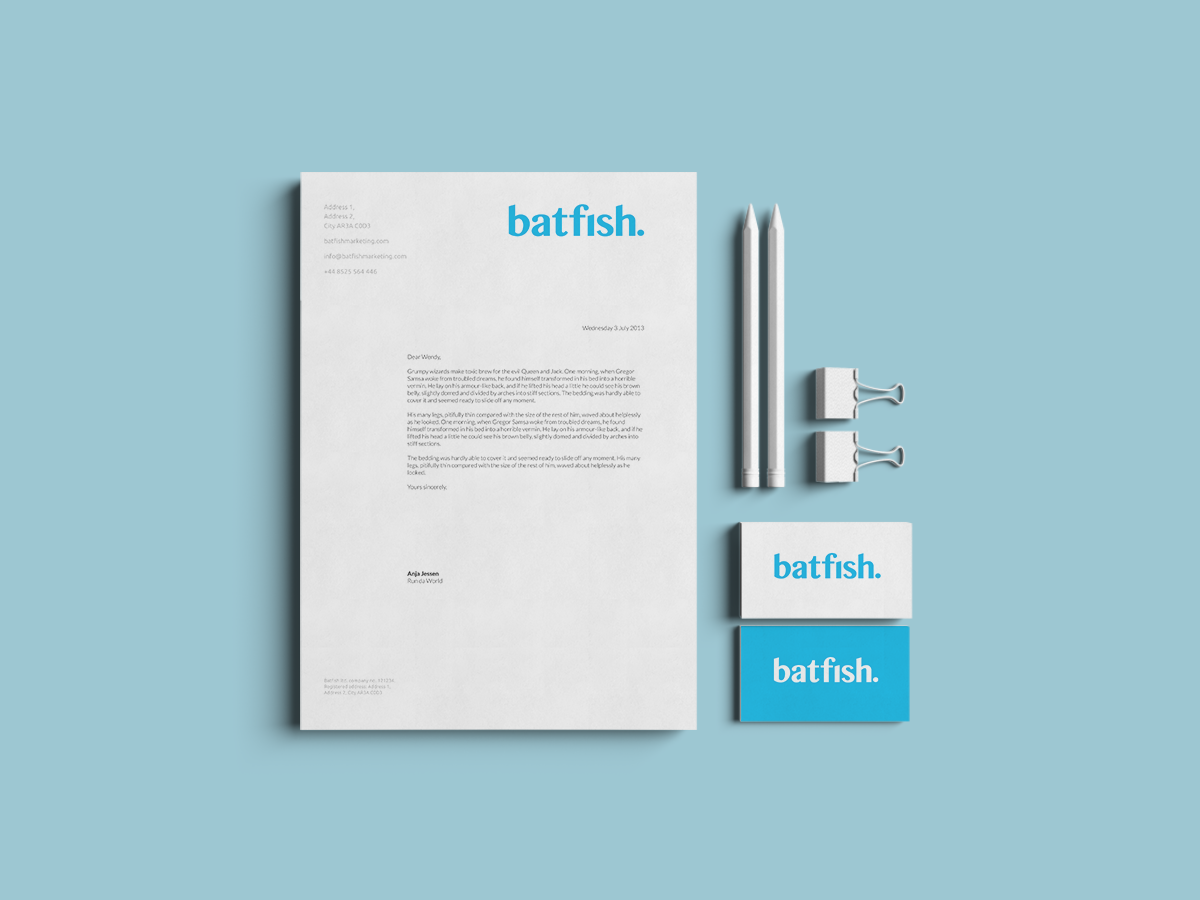
Batfish, the boutique London-based marketing consultancy, asked me to create a fresh new identity that reflected their playful and personable approach to their work.
They wanted to steer clear of explicit references to the aquatic and, instead, focus on the nature of their offering: helping clients find that missing “something” by applying fresh, eagle-sharp eyes to their marketing materials.
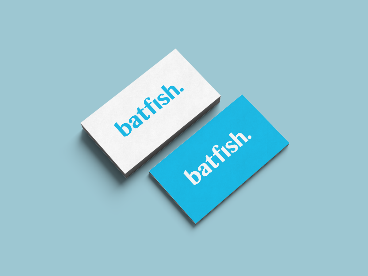
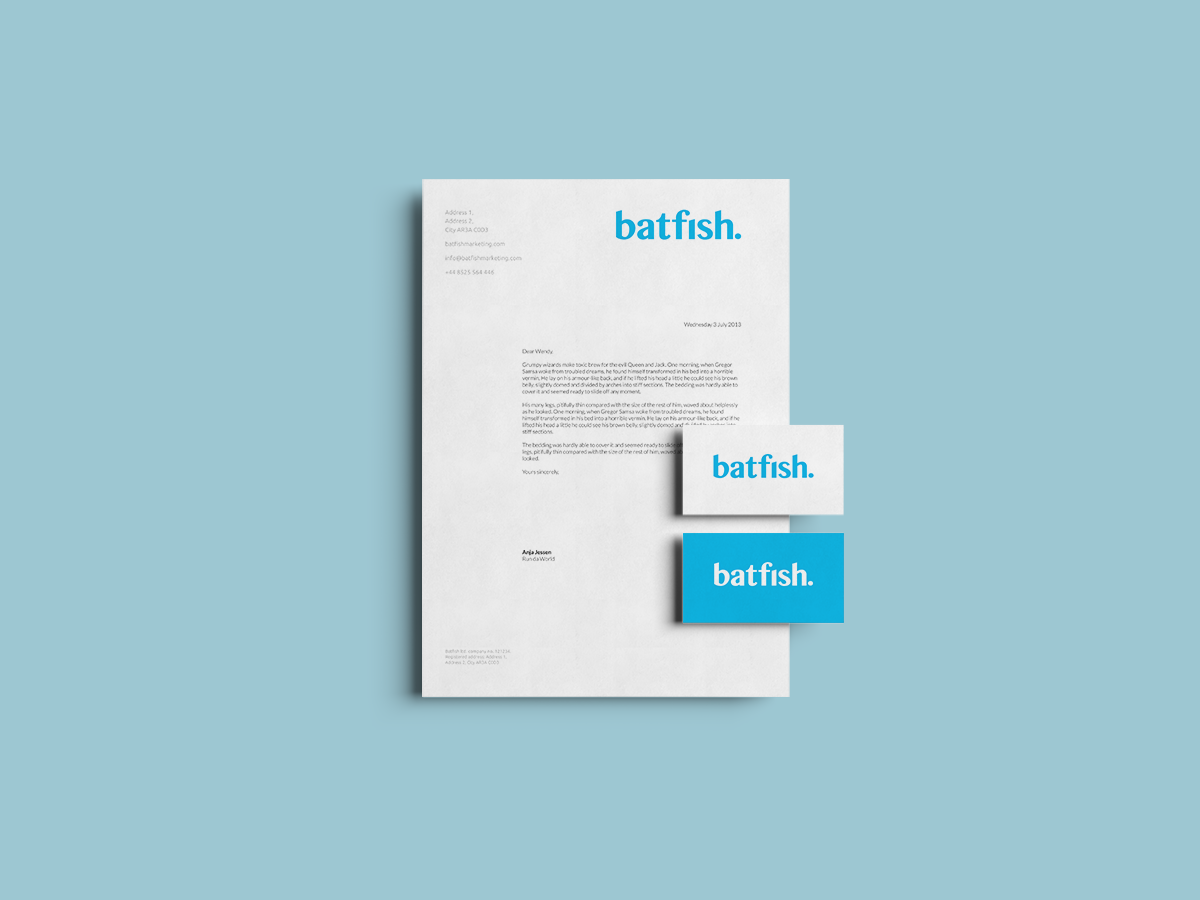
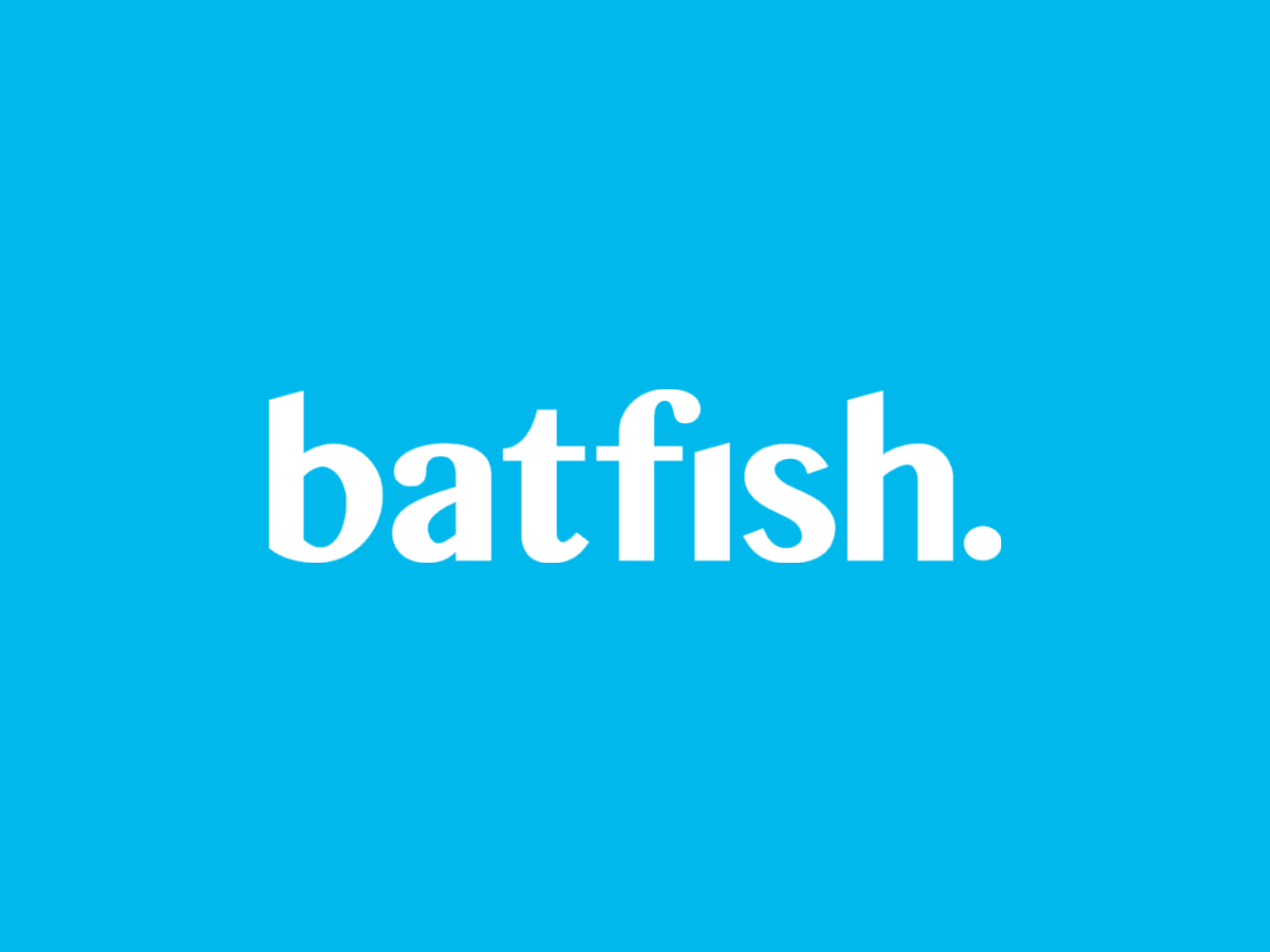
The identity is rendered in a lowercase wordmark, using the bold but legible curves of Tamil MN Bold to create a clear, no-fuss design. A playful and eye-catching reference to the brand’s namesake came in the form of the electric blue primary colour way.
The typography is customised to reflect Batfish’s offering, with the dot of the ‘i’ displaced to the end of the wordmark. At first glance, it seems there is something missing from the wordmark, but by the time you finish reading it, you’ve found it.