
I worked closely with global design studio Checkland Kindleysides to build out a case study for their brand design work on the oral health brand oraHH. Dubbed the ‘pull-up dental practice’, oraHH’s mission is to bring dental healthcare to patients at their place of work with a bright and friendly aesthetic designed to make an infamously stressful process frictionless.
Agency: Checkland Kindleysides Client: oraHH

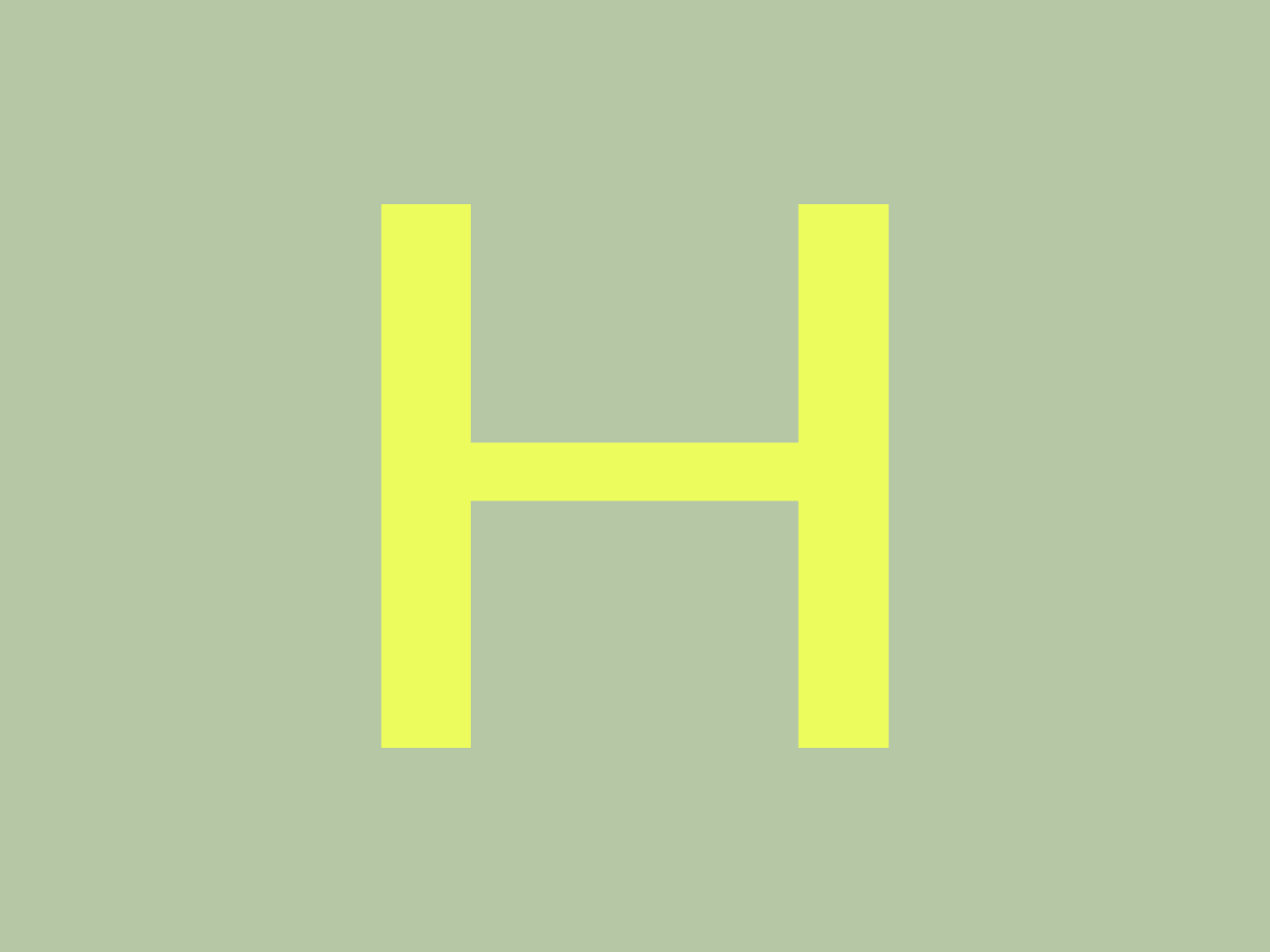
Working with a bespoke typeface, colour palette and brand imagery, I helped bring the brand to life by honing in on the ideas contained within the playful brand design and drawing out typographic ideas to reflect the brand offering. To do this, I started by focussing in on the design of the logotype - exploring motion executions that highlighted the anthropomorphic qualities of the glyphs and referenced the tropes associated with oral healthcare.

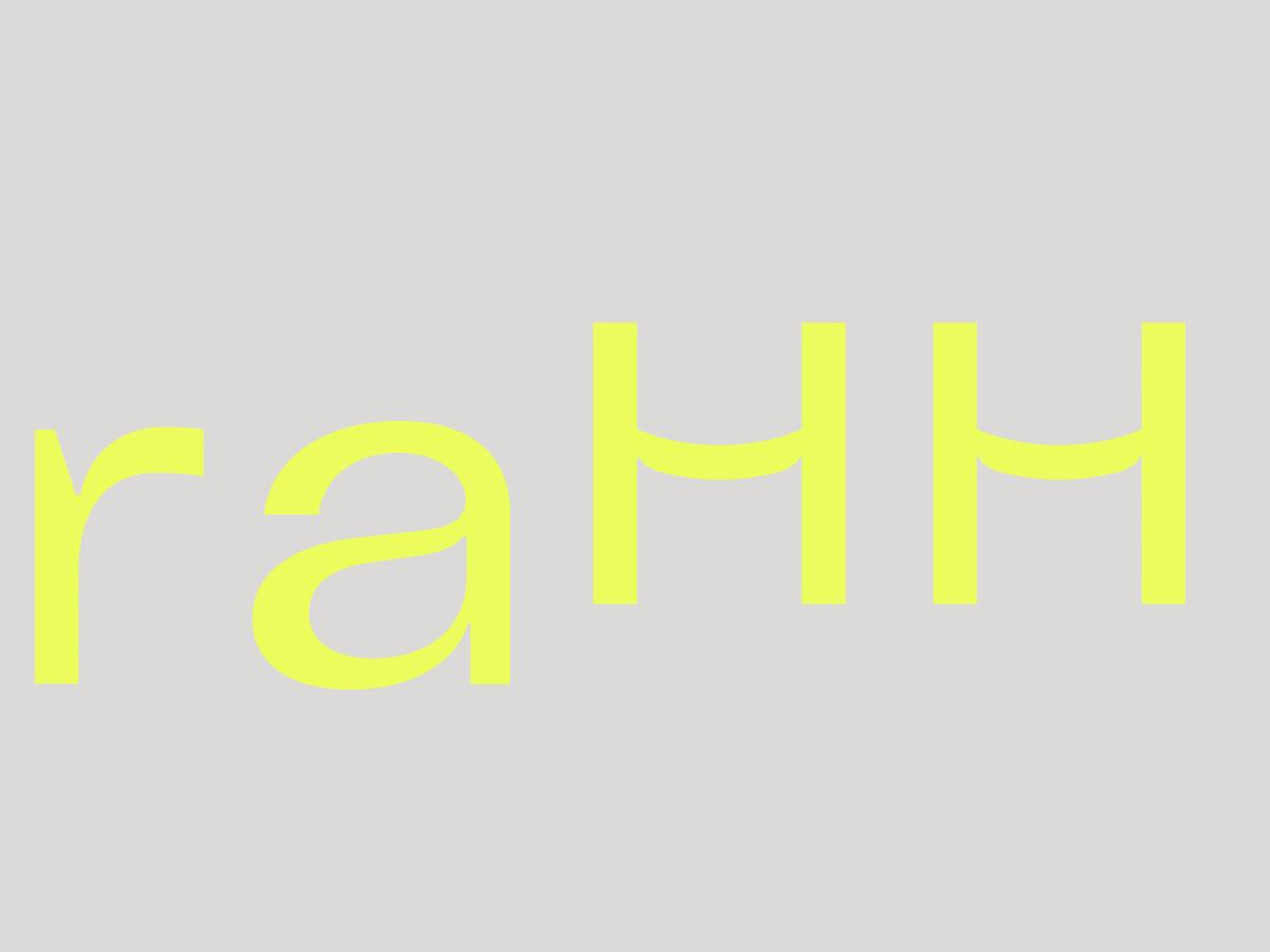
The first motion ideas grew from the idea of the spoken “ahh” synonymous with trips to the dentist and the inspiration behind the logotype. This concept of a sound that starts small and grows led to the idea of using scaling up left to right to give a directional energy to type and be suggestive of speech bubbles. The durational nature of the spoken ‘ahh’ also gave me the opportunity to explore the idea of multiple spawning glyphs moving us around the frame from left to right and up and down.


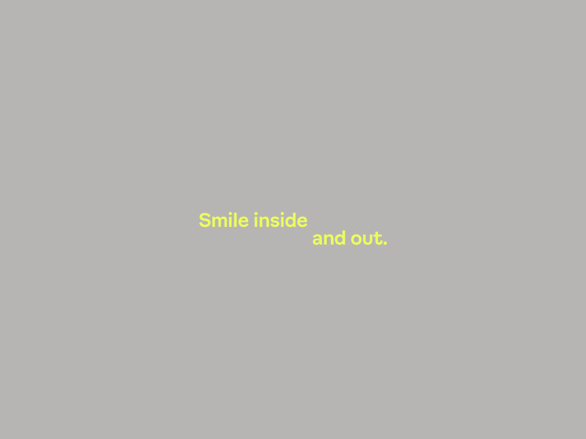
In order to showcase the custom cut oraHH typeface, I created multiple examples of the brand tone of voice - using the playful brand copy and our established motion grammar to create executions that highlighted the offering whilst reinforcing the brand design ideas. Using typography to move us around the frame while playing with scale, allowed me to reflect the itinerant nature of the “travelling dentist” offering key to the brand.