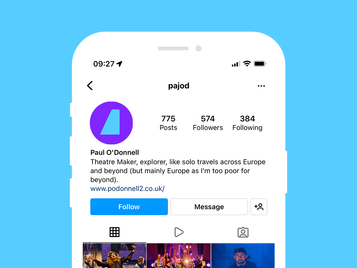

Theatre maker and performer Paul O’Donnell needed a distinctive identity that reflected the playful and self-satirising nature of his work. It needed to reflect the theatricality of his work, whilst also centring his name as the principle asset.
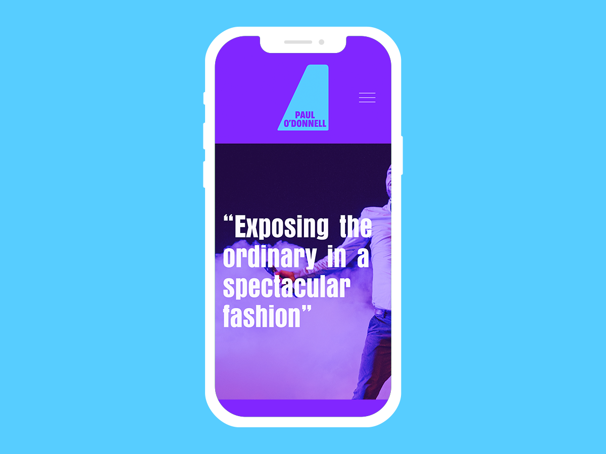
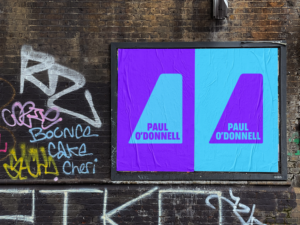
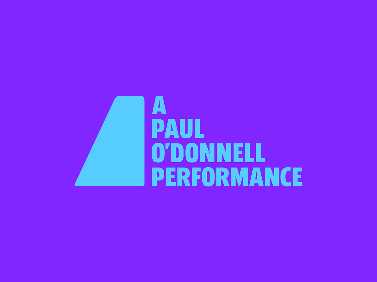
The identity needed to work across several digital touch-points, have a social avatar, and work well in promotional print. It also needed to have an imprint identity to be used for Paul’s performance work and set it apart from his other theatrical work.

I started development by focussing on Paul’s name and exploring its typography to develop various design routes. Part of the brief from Paul had included his mission statement - “Exposing the ordinary in a spectacular fashion”. I eventually focussed in on the apostrophe in Paul’s surname, and started to explore whether or not there was a way of making a spectacle of this very ordinary piece of punctuation.
These developments led to the concept of the “aPODstrophe” - a flipped apostrophe that acts as a spotlight for Paul’s name. The device centred Paul’s name, referenced the theatricality of his work, and gave a nod to self-satire with its slightly off-centre alignment.


Further developments explored the use of colour, focussing on the use of ‘Coventry Blue’ - Coventry being Paul’s home town and an important locus for his work. This was then developed into a palette that included a purple hue to provide contrast and standout.


Paul also needed an animated version of the identity. This presented an opportunity to really emphasise the playful character of Paul’s work. Presented as a simple loop, the animated identity shows our apostrophe element narrow as all of the letters scramble to remain in the spotlight. The light eventually gives in and widens again, causing all of the letters to tumble back into formation.